Monochrome Merchandising
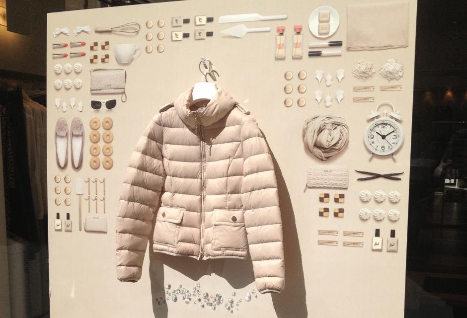
Color craft is part of a merchandiser’s ability. Certain product stories are enhanced by color and arrangements are well thought out so as to minimize confusion. For example, it is well known that certain shades of blue and green, in combination with black, should be presented in a customer-friendly arrangement that allow each color to be distinguishable from the other – reducing mix-ups, accidental purchases, and ultimately returns.
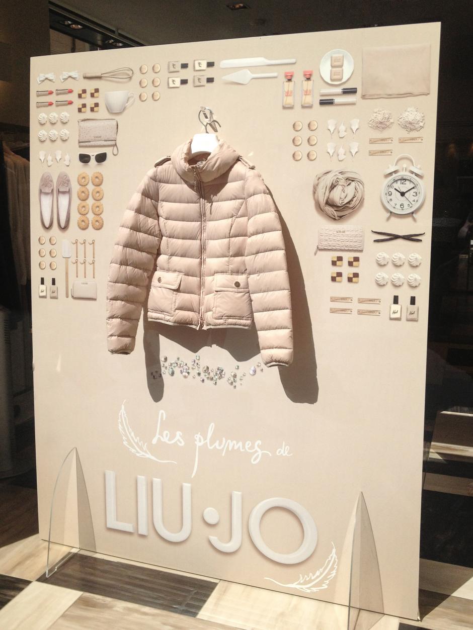
In contrast – literally – to this school of thought are the window displays at Liu Jo. The still life photographic arrangement in pale pink is a trend in both color and form. Possibly inspired by the work of Carl Kleiner and Evelina Bratell’s work on the Ikea cookbook Hembakat är Bäst (Homemade Is Best), Things Organized Neatly’s clever Tumblr, and Swedish installation photographer, Helga Steppan’s “See Through” series, the simplistic display is visually refreshing in comparison to the others near the Via del Corso.
We love the retailer’s take on combining lifestyle objects with one important statement piece. This standout presentation is an example of marketing, brand, and creative collaboration that is relevant to multiple trends in food, fashion, and consumer packaged goods.