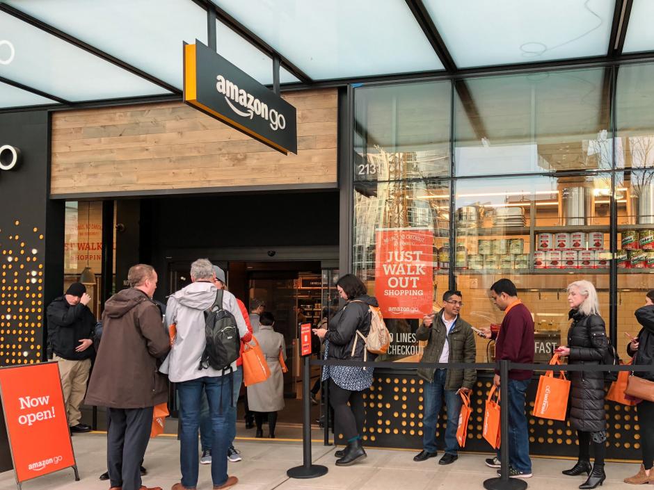
Opening Day at Amazon Go
1.22.18 | by Trendscaping Editors
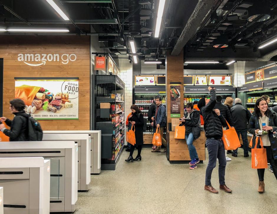
There’s a familiarity in the store design and merchandising at Amazon's new smart-retail experience. Subway-esque turnstiles at the entrance with commissary cues in the front, grocery fixtures displaying an array of elevated convenience foods on the shelves, and marketing to validate the emotional pressures of a time-starved societal structure. For those living an ephemeral mobile lifestyle, Amazon Go is the technology-fueled expedient answer.
Topline insights from our checker-less experience in Seattle on opening day.
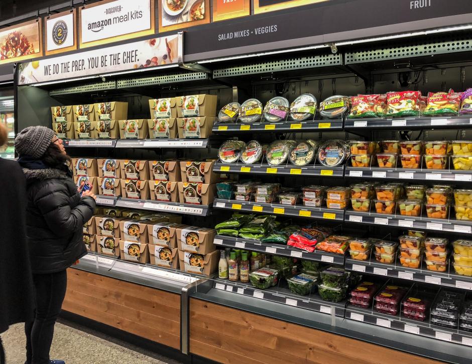
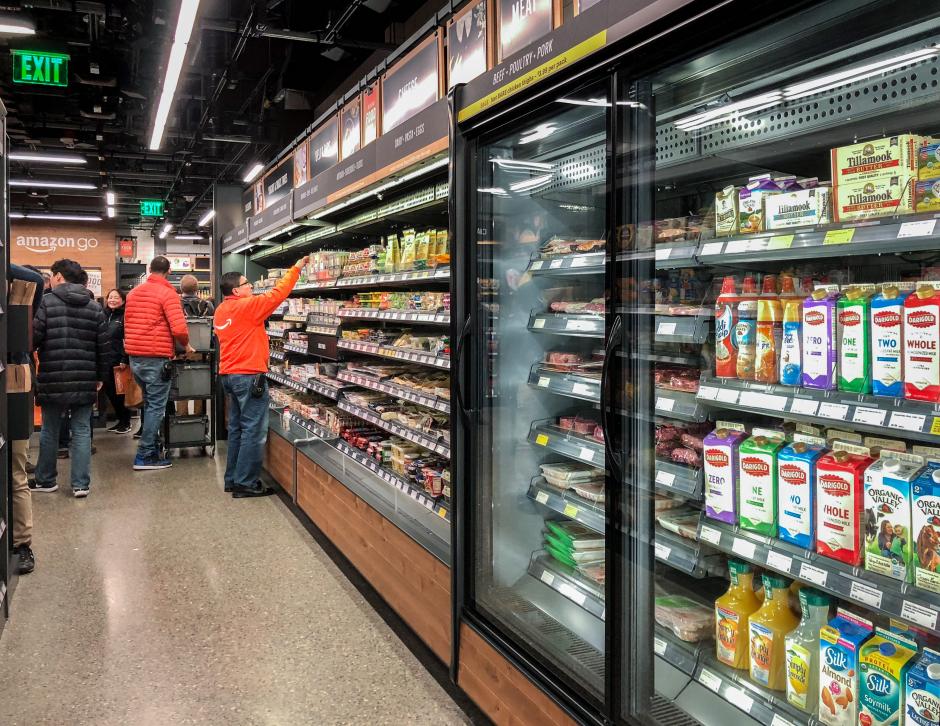
- Within the 1800-square foot space, the concept focuses on grab-and-go, packaged meals, snacks, beverages, and packaged foods for all dayparts. Fresh food's in plastic or “shrink-wrapped” – from ready-to-heat meals to vegetables; with an emphasis on convenience and availability.
- Contrary to popular food merchandising trends in grocery and farmers markets across the globe, there’s minimal storytelling around local, organic, fresh, and sustainable products. The ownership for communicating these benefits to the consumer lies with the manufacturer's packaging. The one exception is on a tertiary end-cap where exclusive, co-branded Theo Chocolate & Amazon is merchandised and marketed as local.
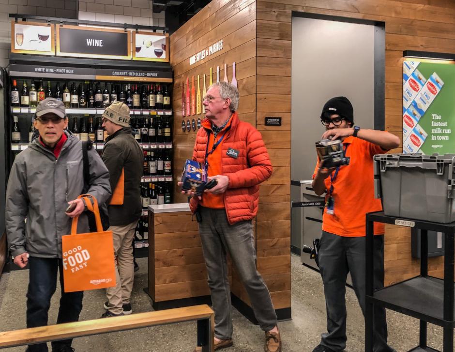
- Staffing on a whole is greater than at a store that has cashiers due to the customer service helpers, stock-people, chefs, and ID checkers (for alcohol) working on the floor.
- The Amazon Go app tracks your items and how long each visit to the store lasts – an interesting use of gamification.
Specific merchandising and design takeaways.
- Amazon Go puts a premium on the customer's time, not the store materials. With the exception of the technology and AI used within the store, which we can only assume is top quality, the exterior and interior schematic is straightforward. See more photos from our trip on Instagram.
- Touted by many as "the store of the future," the look and feel of the fixtures is fairly mainstream - with black refrigeration cases, black shelving, black chalkboard-style signage, and a hint of vertical wood paneling near the gates where customers scan their app for entry.
- Unlike a convenience store, the aisleways are quite spacious to allow for maximum customer and employee flow during peak times. Space, like time, is viewed as a valuable commodity in the design scheme.
- Much like the perfect grids on the Amazon.com website, the merchandising is tight, orderly, and clean. For any item that can not be replenished, a “sorry, out-of-stock sign” takes its place. Given that it’s been in beta for over a year, the environment (with the exception of the large crack in the floor seen in the second photo) is in remarkably good shape for the daily employee scan-and-shop foot traffic.
- The most interesting visual merchandising categorization was the cross-promotion of wines with meal-kits, using a color system. For example, a bold red pairs with steak or mushrooms, medium red pairs with steak or root vegetables, light red pairs with chicken or pork, bold white pairs with chicken or root vegetables, aromatic white pairs with shellfish or cured meats, crisp white pairs with fish or chicken, sparkling pairs with shellfish or fried foods, and rosé pairs with chicken or salad. It’s not a foolproof system, but an interesting evolution in how wine is referenced without a knowledgeable guru on-hand.
Opportunities that could be included in future concept evolutions.
- We’d like to know what “good food fast” really means for Amazon and Amazonians. Specifically, we’d love to see more transparency on produce, fresh-packaged grab-and-go, heat-and-serve meals, and prepare-and-serve meals. Transparency is always on trend.
- Take a cue from the open kitchen trend in restaurants and open up the fresh food production space to the interior of the store (the exterior is already viewable, as per our story from 2016). The use of integrated technology, experiential retail, and human touch help to foster community and collaboration.
- Leverage the acquisition of Whole Foods at Amazon Go. Within the store, the 365 line of products represents a very small percentage of SKUs with one bay of 20+ items. We assume this is due to the proximity of the organic grocery store four blocks away, but would love to see more cross-pollinization.
- In an effort to minimize friction in retail transactions and improve convenience, Amazon has a lot of waste to consider from packaging food instead of selling it by the pound with this concept. This should be addressed if the store is to evolve from proof-of-concept to appeal to a multi-generational audience from all industries and backgrounds.
- Interject the cultural passion for food into the concept with personality and presentation. Convenience is great, but we would recommend looking at consumer reviews and emotional connectivity as a key element to Amazon’s total success across all properties.
Insight Location
Amazon Go Seattle, WA United States
See map: Google Maps